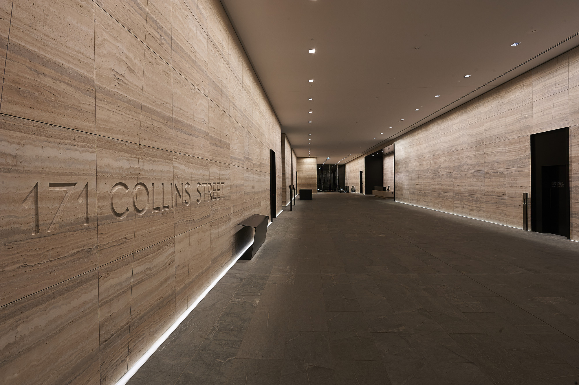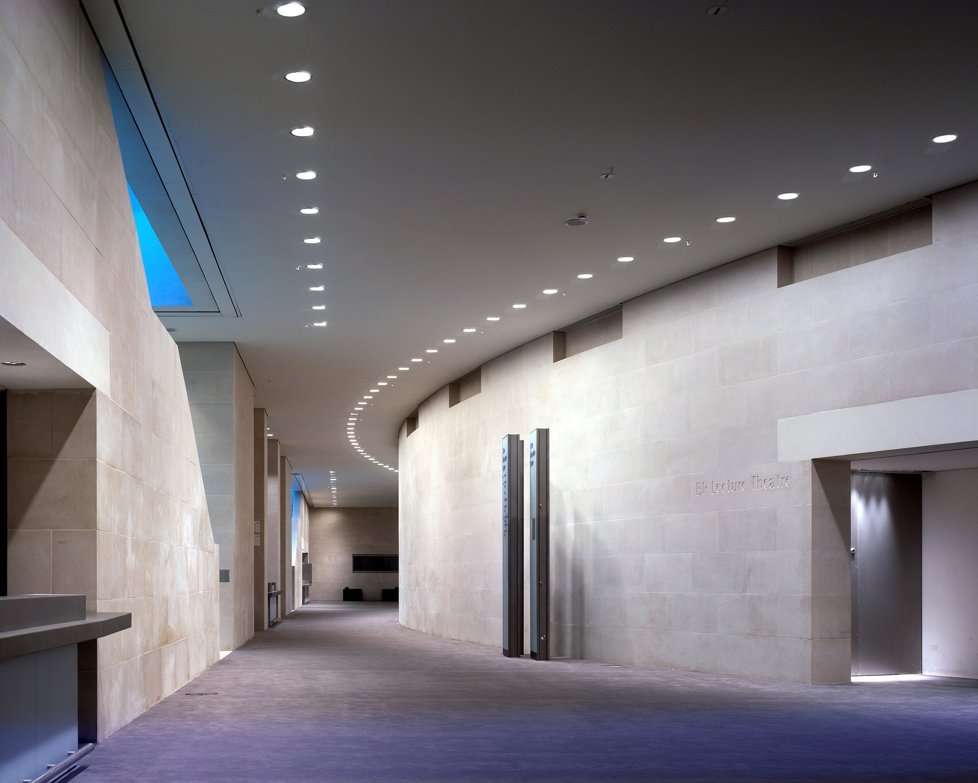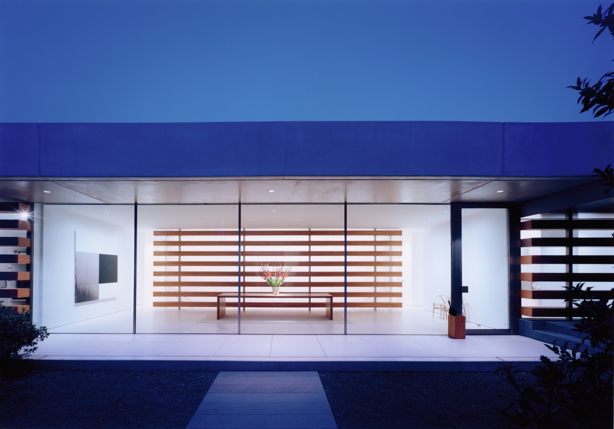
Modernism induced a shift in lighting away from luminaires and towards invisible light sources that render spaces in a purer (forgive the pun) light. For the first time, lit walls were used to define rooms and to structure architecture. Today I’d like to explore early prototypes - including Philip Johnson’s Brick House and the Seagram Building - and discuss how their lighting techniques continue to influence architecture today.

When Philip Johnson remodeled the windowless bedroom in his Brick Guest House, he installed a series of plaster vaults from the ceiling, which he then emphasized with lighting. In collaboration with the American lighting specialist Richard Kelly he developed the idea of creating a glow of light that washes the walls. The concealed light sources created a mysterious impression for the intimate space. According to Phyllis Lambert, founding director of the Canadian Centre for Architecture in Montreal and the recent winner of the Gold Lion at the Biennale, the atmosphere reminds one of nightfall in the desert as the light gradually fades.
Johnson and Kelly developed the wall concept further when they designed the sophisticated lighting concept for the Four Season Restaurant at the Seagram Building. At the entrance they welcomed guests with uniformly light-washed walls. Kelly heightened the atmosphere in the dining room with a spectacular grazing lighting effect: he introduced shimmering metal chain curtains that, thanks to air from the convectors at the windows, fascinated with their wavelike movements. Kelly also used recessed fixtures to conceal luminaires, thus heightening the drama.

The concept of uniform wall-washing perfectly articulated the intents of the international style; the even illuminance became an important tool for taut plane surfaces to generate a visually weightless quality and to define the spatial envelope.

Grazing light is a similar technique to wall-washing, but its major advantage lies in emphasizing textural qualities. The grazing approach requires light sources or narrow skylights that are arranged close to the wall to bring out the characteristic shadow effects. Even for relatively neutral surfaces – like smooth poured concrete walls - the grazing light can add drama.
The Sancaklar Mosque is an excellent example of the mysterious impression these invisible illuminants can make: in this case the architects combined natural light from skylights with electrical lighting.

The full supremacy of grazing light becomes visible on highly textured surfaces. Rough structures like brick or extremely modeled surfaces, such as those Yabu Pushelberg designed for the Blue Fin Restaurant in New York, enable an intense play of light and shadow. The Blue Fin’s waves present a theatrical gesture for the soaring staircase while the recessed ceiling adequately conceals the luminaires for the dominant grazing light effect.

In contrast to wall-washing and grazing light, which strive for a bright, planar impression of the entire wall, wall-slot lighting concentrates on a bright line. This technique makes the ceiling appear to float; the architecture is interpreted through the outlines of the spatial envelope. It focuses on the separation of ceiling and wall instead of emphasizing the space as a volume, as the international style architects aimed for. Regardless, the luminaires are typically concealed from view to achieve a mysterious impression.

Contemporary LED technology has led to a new light typology for walls: the self luminous wall with integrated LED pixels. The appearance of LEDs ranges from clear visibility to emphasize the technical character up to sophisticated design solutions, where the LEDs are concealed behind a translucent plane. Innovative options have emerged from the combination of colour changing LEDs, video control systems and sensors. These walls have left behind the pure white wall-washing of the rational international style and established a new generation of animated architecture with software programmable and responsive planes.

Light matters, a monthly column on light and space, is written by Thomas Schielke. Based in Germany, he is fascinated by architectural lighting, works for the lighting company ERCO, has published numerous articles and co-authored the book „Light Perspectives“. For more information check www.arclighting.de or follow him @arcspaces


